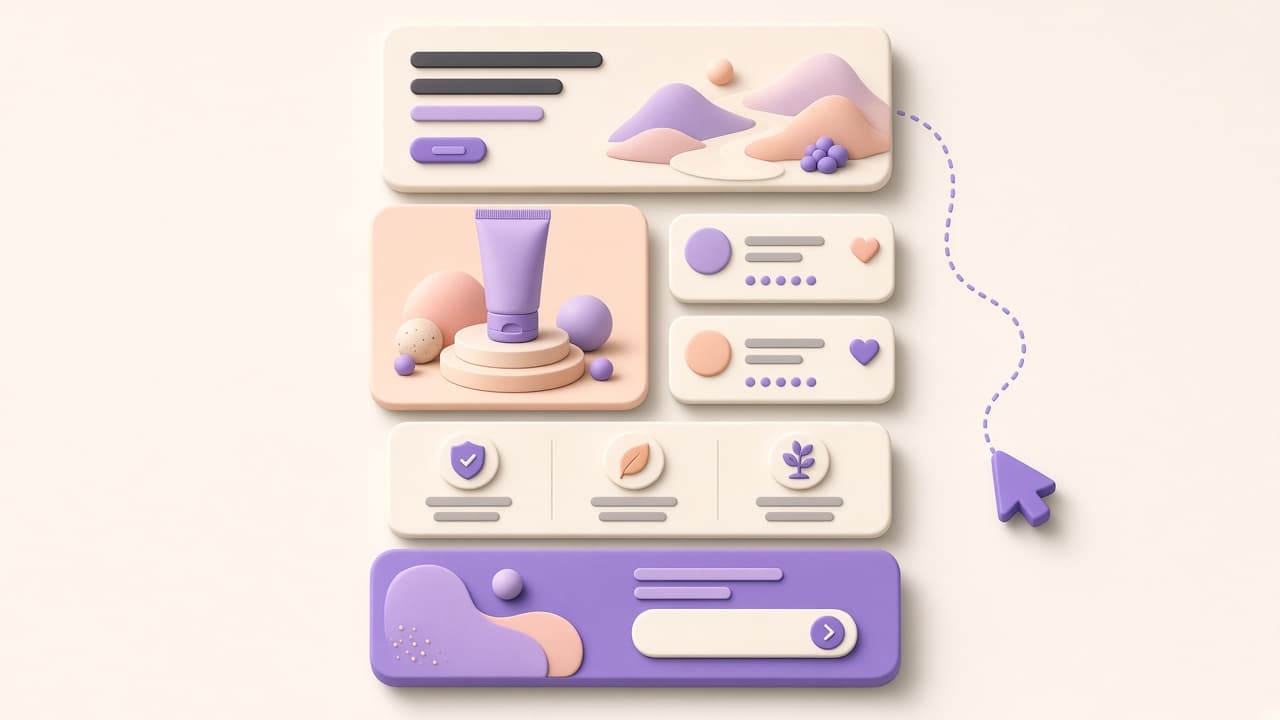
Ecommerce Landing Page Design: The Anatomy of a High-Converting Page
A landing page is not your homepage with a different headline. It is a single-objective page engineered to convert one type of visitor from one traffic source. Here is how to design it correctly.
One page, one goal
The highest-converting landing pages eliminate navigation. No header links, no footer links, no 'you might also like' sections. Every element exists to move the visitor toward one action: buy, sign up, or request a demo. When you give visitors three choices on a landing page, a significant portion takes none of them. Remove the exits.
Hero section structure
- Headline: the primary benefit in under ten words.
- Subheadline: who it is for and why now.
- Hero image or video: product in use, not a studio render.
- Primary CTA button: above the fold, high-contrast color.
- Micro-copy below button: remove risk ('Free returns · No commitment').
The headline is the most-tested element on any landing page for good reason—it carries the majority of conversion weight. Test benefit-first headlines against feature-first ones. 'Stop losing customers to slow support' outperforms 'AI Support Software for Shopify' because the first speaks to pain, the second speaks to category.
Social proof placement
Place social proof in three strategic positions: directly below the hero (to validate the headline), adjacent to the primary CTA (to reduce last-second hesitation), and at the bottom before the final CTA (to close the case for undecided scrollers). Use real quotes with real names and photos where possible—generic stars without context are almost invisible.
Friction removal
Every field, click, and decision you add to the conversion path costs you conversions. For ecommerce landing pages: pre-select the most popular variant, show total price with shipping included (or explicitly say free shipping), and offer guest checkout as the default path. Requiring account creation before purchase remains one of the highest-cost design mistakes in ecommerce.
CTA design and copy
Button color should contrast with everything around it—not match your brand palette. Copy should be specific and first-person: 'Get My Free Trial' converts better than 'Submit' or 'Click Here.' Size matters: the primary CTA should be large enough to tap without zooming on mobile. And repeat it: at the hero, after social proof, and at the bottom of the page.