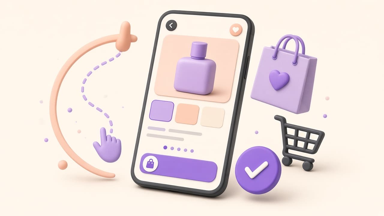
Mobile Ecommerce Design: Why Your Phone Experience Loses You Sales
Desktop conversion rates are typically two to three times higher than mobile—not because mobile shoppers are less serious, but because most Shopify stores design for desktop first and patch mobile as an afterthought.
The mobile traffic reality
Shopify's own data shows that for most DTC brands, sixty-five to seventy-five percent of sessions are on mobile, but mobile conversions average forty to fifty percent lower than desktop. That gap is the mobile UX tax you are paying. Closing half of that gap—through focused mobile design improvements—can have a larger revenue impact than any marketing optimization you are likely running.
Thumb zone design
Mobile UX research has mapped the 'thumb zone'—the areas of a phone screen reachable with one thumb during single-handed use. The bottom center is easy; the top corners are hard. Design your most important interactions—Add to Cart, swipe gallery, variant selection—into the bottom half of the screen. Navigation that only lives at the top forces a two-handed interaction and increases friction for the most common device usage pattern.
- Sticky 'Add to Cart' bar fixed at the bottom of the screen.
- Swipeable product image gallery—tap to zoom, pinch to zoom.
- Size/variant selector as a bottom sheet, not a dropdown.
- Search bar accessible without scrolling to the top.
Image optimization for mobile
A desktop product image at 2000×2000px served to a mobile screen at 375px wide is loading four to six times more pixels than needed. Shopify's CDN serves responsive images if your theme is set up correctly, but many legacy themes do not implement `srcset` for all image placements. Check your mobile page weight in Chrome DevTools—images should be your first optimization target and commonly represent seventy to eighty percent of page weight.
Mobile checkout friction
Shop Pay is the highest-converting mobile checkout option on Shopify—it pre-fills shipping and payment for returning users. Enable it if you have not. For new customers, Apple Pay and Google Pay one-tap payment dramatically reduce form abandonment on mobile. Every form field a shopper does not have to type on a phone keyboard is a friction point removed.
How to test properly on mobile
Chrome DevTools mobile emulation is a starting point, not a real test. Real mobile testing means loading your store on an actual device over a real cellular connection, completing a purchase from product page to confirmation, and timing how long each step takes. Do this on an older Android device—they expose performance problems that flagship phones mask. Share your store with five people who have never seen it and watch them navigate without helping them.